You want a home decor logo that fits a style and tells a story about the space it represents. A strong logo can show your brand’s taste, attract the right customers, and set the tone for every product or project you present.
This guide will walk you through styles from clean geometric marks to warm, hand-drawn botanicals. That way, you can pick a direction that matches your vision.
We’ll get into how color, font, and texture shape different looks—modern minimalism, nature-inspired motifs, elegant script with gold, retro palettes, and rustic wood backgrounds. Expect simple explanations and real examples to help you find a logo style that feels right for your brand.
1) Minimalist geometric shapes for modern home decor logos
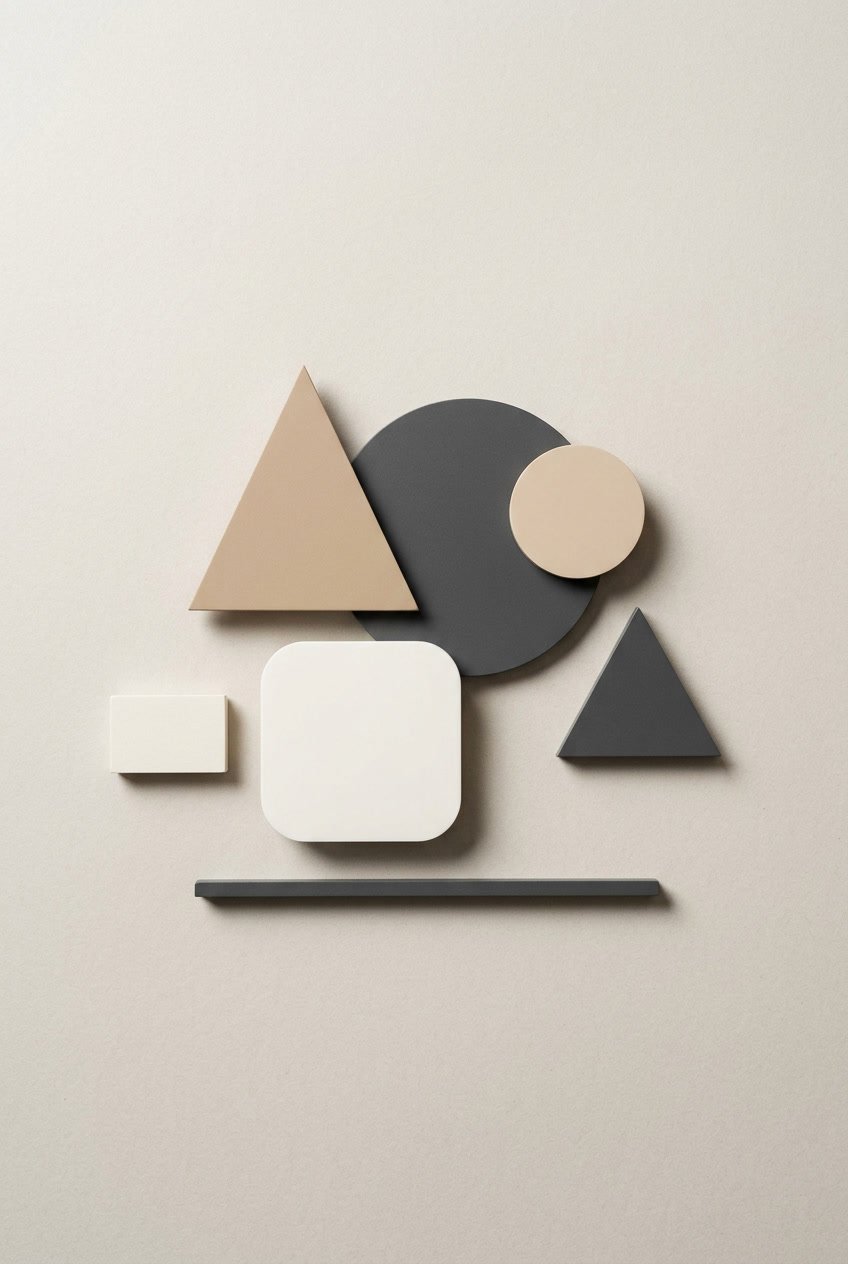
Designers use simple geometric shapes to create clean, modern home decor logos. Circles, squares, and triangles give a sense of balance and order without any fuss.
They usually stick to a limited color palette, letting the forms do the talking. Negative space sometimes hides subtle symbols, so logos stay minimal but don’t feel boring.
These logos scale nicely for labels, websites, and packaging. The look is current and professional, not overdone.
2) Nature-inspired leaf and plant motifs
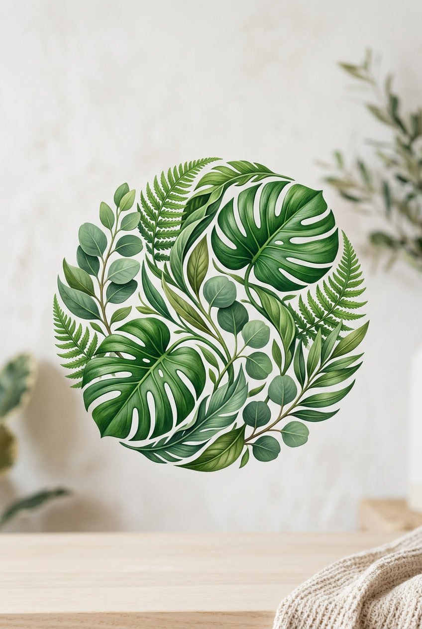
Leaves and plants in logos signal calm, growth, and eco-friendly values. These motifs look great with simple shapes and muted greens for a fresh, modern vibe.
A leaf icon next to a home silhouette ties nature to living spaces. Little vine details or botanical lines add cozy warmth.
Minimalist plant marks keep things timeless. They look good on labels, websites, and social media too.
3) Elegant script fonts paired with gold accents
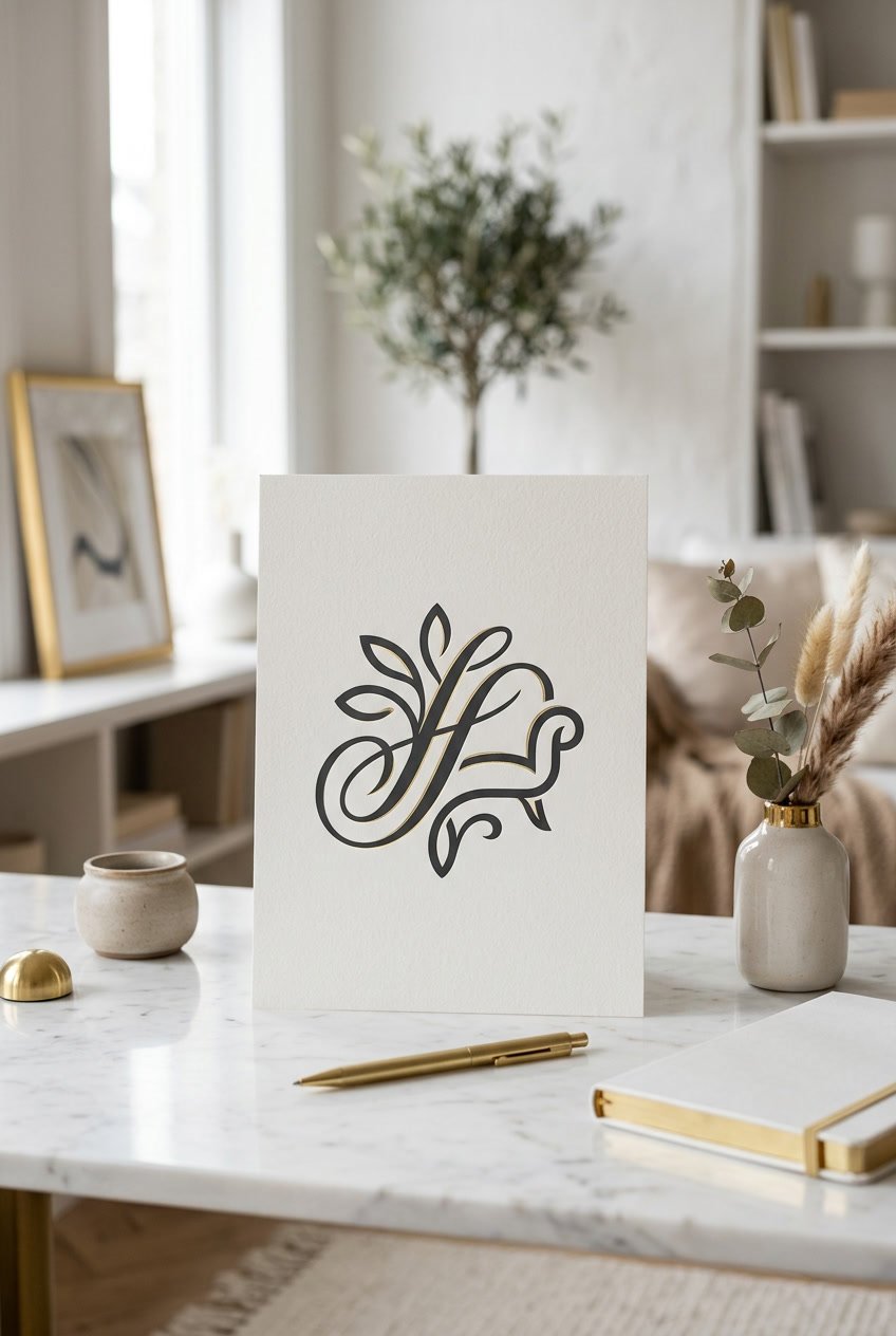
Elegant script fonts give a home decor logo a refined, personal touch. Flowing letters suggest craftsmanship and warmth, but never feel too flashy.
Gold accents bring in a bit of luxury, making the script stand out on labels or business cards. Used sparingly, metallic touches highlight key words and keep things balanced.
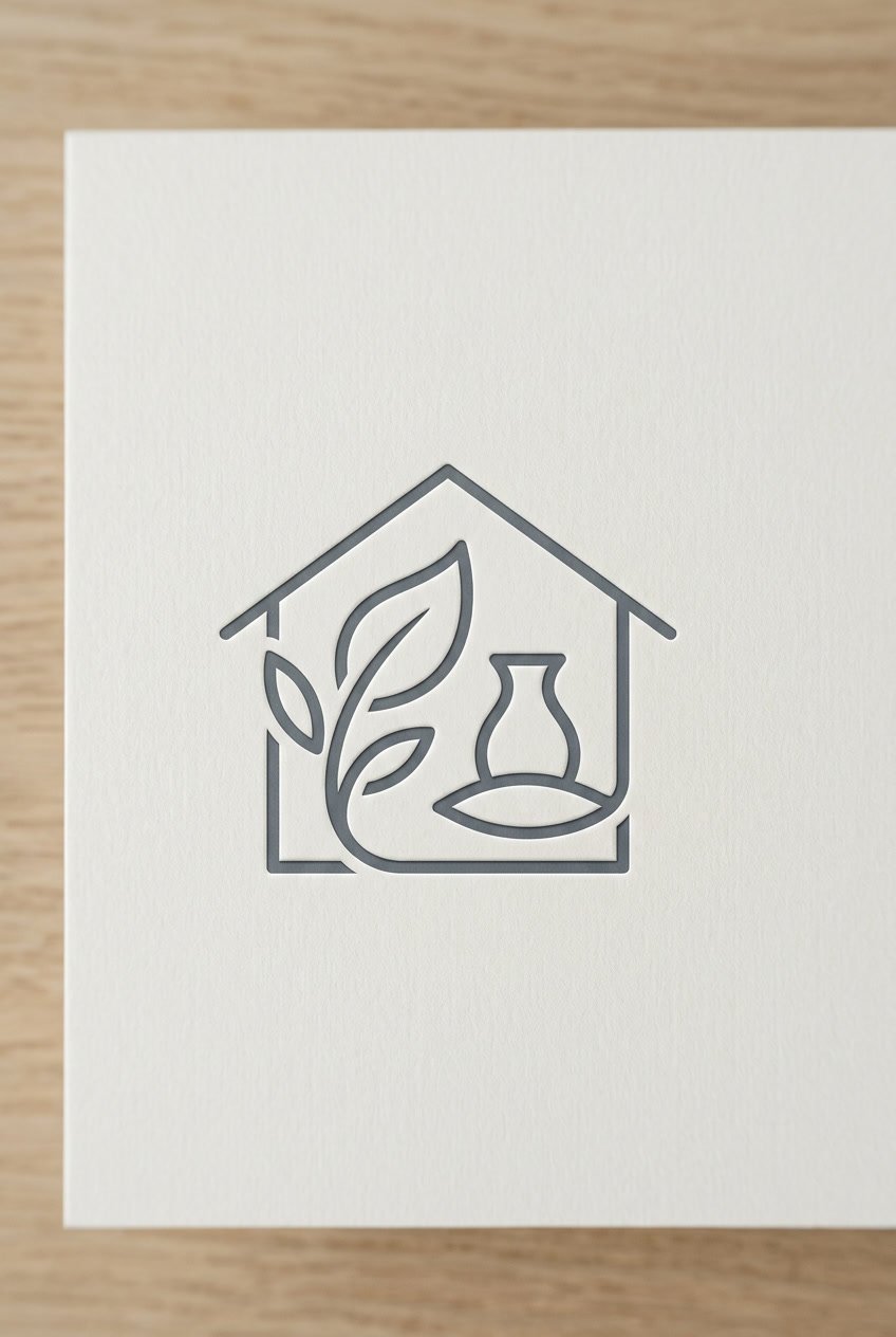
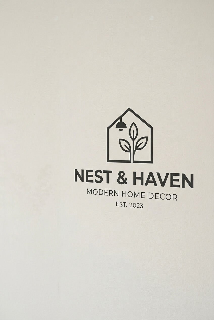
4) Abstract house icon with clean lines
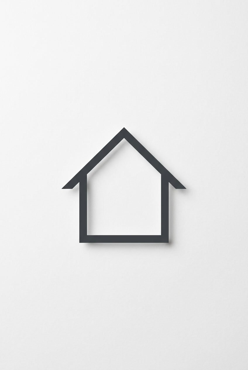
Abstract house icons use simple shapes and thin, even strokes for a modern look. It’s a clear, calm style that fits all sorts of brands.
Designers like open space and balanced proportions. That way, the mark stays readable at any size and pairs easily with type and color.
5) Retro mid-century modern color palettes
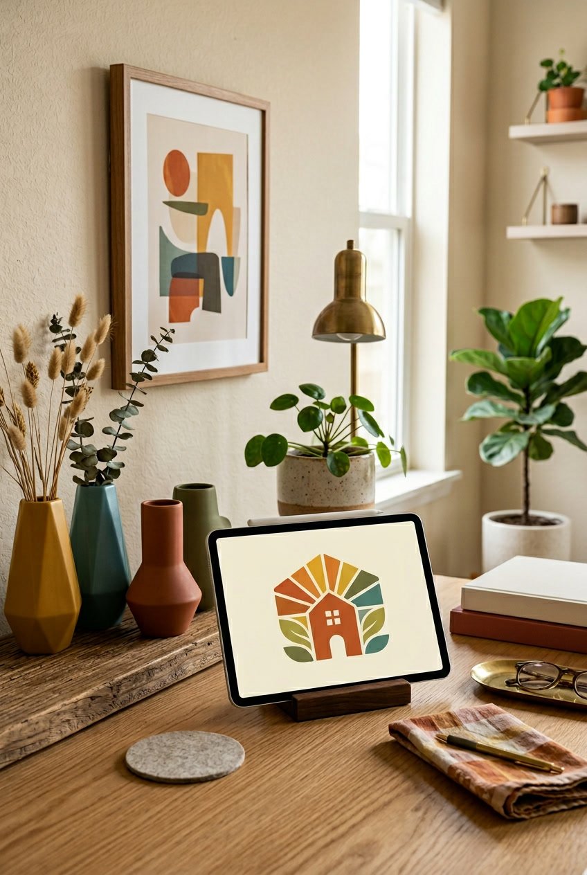
Warm neutrals mixed with bold hues like mustard, teal, and avocado green give logos a vintage feel. But it’s not the kind of retro that feels stuck in the past.
Designers usually pick a muted background with one bright accent for contrast. It keeps things readable and stylish, even when scaled down.
Wood tones and soft grays add warmth. A good palette really ties the brand together and nods to mid-century interiors.
6) Hand-drawn botanical illustrations
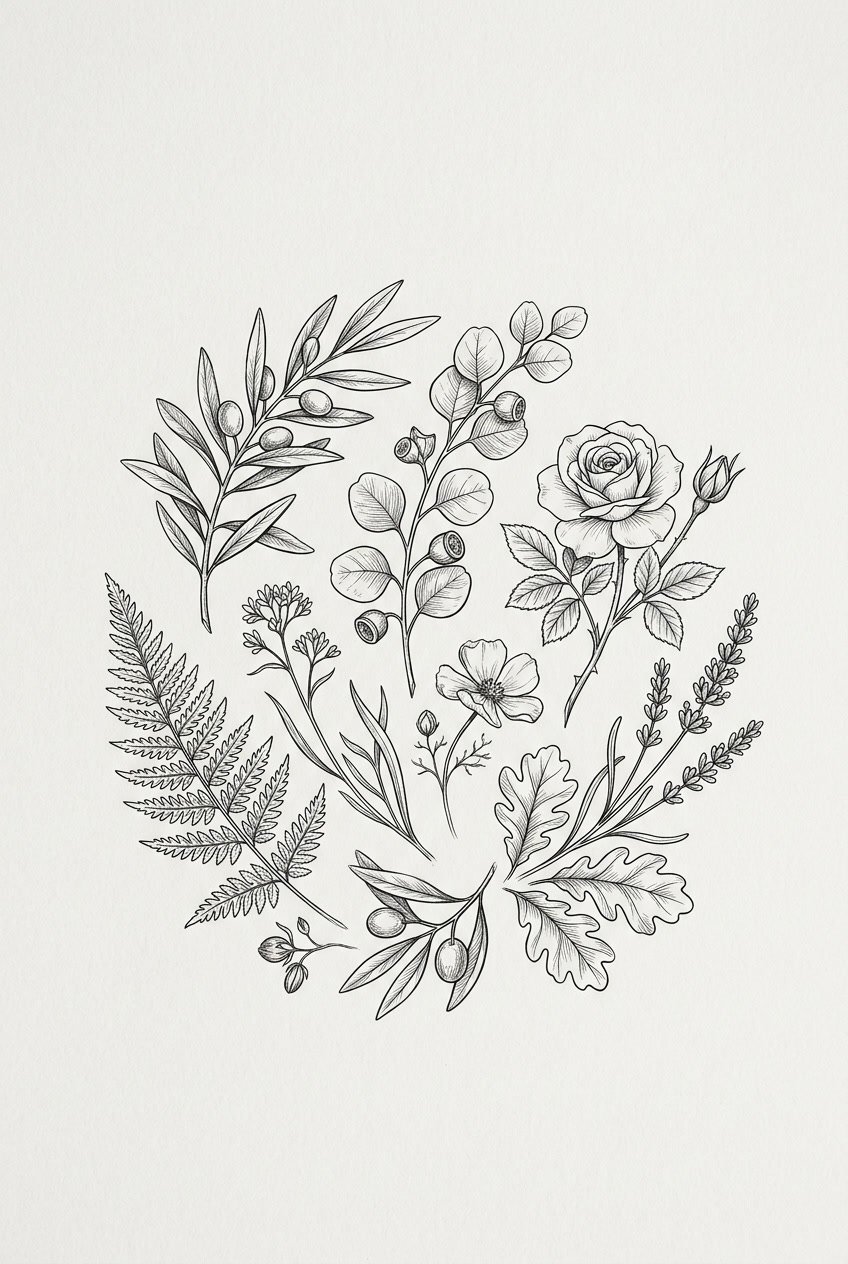
Hand-drawn botanicals bring a warm, organic vibe. Simple line drawings or detailed foliage hint at handcrafted quality and natural materials.
They look great with muted colors and textured backgrounds. Pair them with serif or soft sans-serif fonts for balance.
These illustrations scale well for labels, tags, and signage. That’s handy for both print and digital.
7) Monogram logos using initials with decorative frames
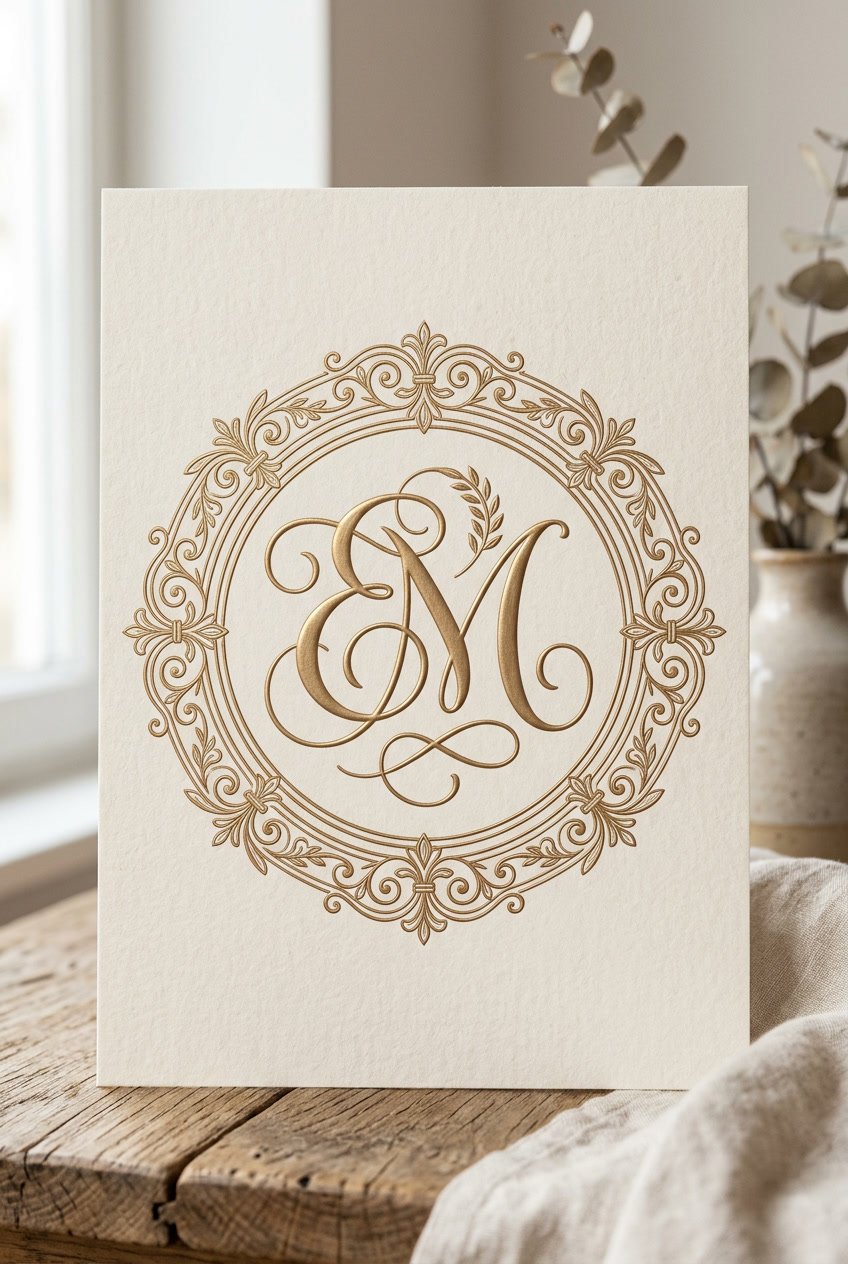
Monogram logos use initials and a decorative frame for a focused, elegant mark. They’re perfect for brands wanting a classic or boutique vibe.
Designers like simple serif or script initials inside wreaths, circles, or ornate borders. It keeps the logo readable but adds a bit of flair.
Frames can hint at style—rustic wood, modern lines, or vintage filigree—matching the product range. Proper spacing and contrast keep the mark clear at any size.
8) Watercolor textures for soft, artistic appeal
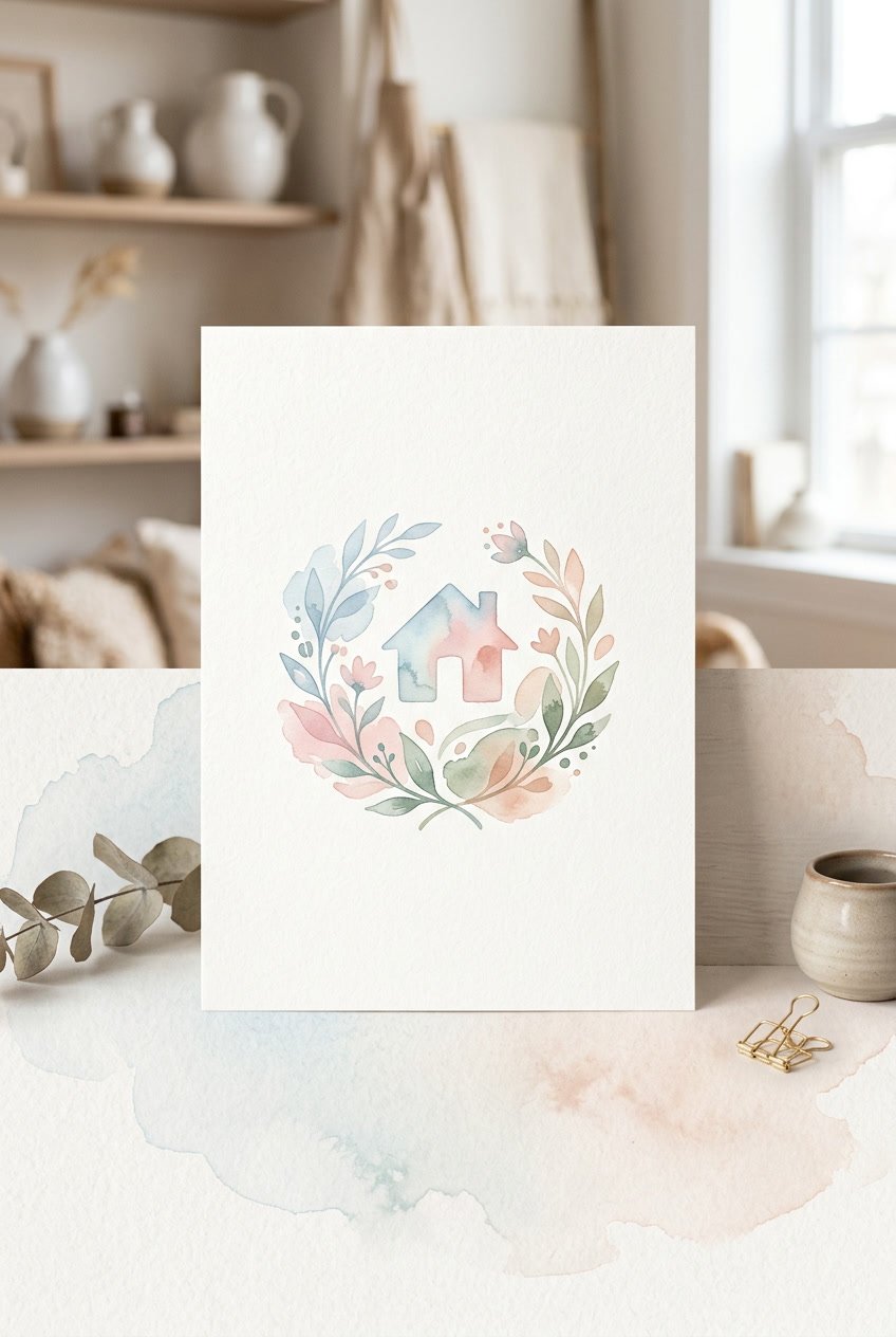
Soft watercolor washes give a home decor logo a gentle, handmade look. Light pastels and flowing edges create a calm mood that doesn’t overpower the brand.
Designers sometimes layer these textures behind type or icons for depth and warmth. It’s a good fit for brands wanting a creative, approachable image—while keeping things clean.
9) Bold sans-serif typography with minimal icons
Bold sans-serif wordmarks give logos strong readability and a modern vibe. They work on labels, websites, and product tags.
Pairing bold type with a tiny icon—maybe a line-drawn house or a leaf—adds a visual cue without clutter. The icon should match the weight and spacing of the type for a balanced look.
This style’s great for brands that want a clean, confident feel. It stays legible at small sizes and adapts well to different colors and materials.
10) Rustic wood texture background in logos
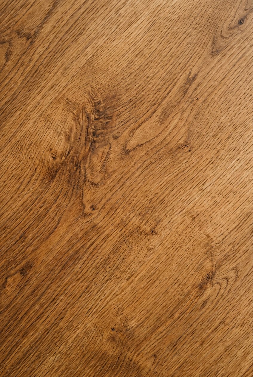
A rustic wood texture brings this familiar, handcrafted vibe to home decor logos. You’ll spot grain lines, knots, and earthy tones that just feel like, well, actual wood.
Designers usually throw wood backgrounds behind simple, bold typography. That way, you can still read the name without squinting.
It’s a look that works for brands chasing that authentic, cozy, timeless thing. Who doesn’t want their logo to feel a little bit like home?